In this blog post, you will find a step to step insights into creating a user manual for the hexagonal composter. This blog would educate you with the process followed i.e from planning to implementation, to achieve the design for the hexagonal composter manual.

Firstly, I was assigned the project to design a manual for the Akshay Home Composter. This product is recently being fabricated in Vigyan Ashram and delivered to the respective customers. While delivering the product, the manufacturer wants the customer to receive detailed information about the product and how it is supposed to be used?

Since the product was already developed, I had to analyze the data that someone else already collected (known as the secondary data). This data saved my time and I was able to expand the scope of the research but I didn’t have the control over the content or reliability of the data.
I had to choose criteria on the basis of which I would further select the source (online or physical archive). It is was really necessary for me to have knowledge about the product, So that it is easier to compile the information and present it according to the user’s concern.
It was easy to interpret the data when you use the 4W’s.

What is the product?
Akshay Home Composters are structures designed to hasten the decomposition of organic matter through proper aeration and moisture retention through the process called composting. Composting is the biological decomposition of organic waste such as food or plant material by bacteria, fungi, worms, and other organisms under controlled aerobic (occurring in the presence of oxygen) conditions.
Who will be using the product?
The product can be used by users who do gardening, landscaping, horticulture, urban agriculture and organic farming. The compost itself is beneficial for the land in many ways, including as a soil conditioner, a fertilizer, addition of vital humus or humic acids, and as a natural pesticide for soil. Therefore my target users were farmers and gardeners.
Where it will be used i.e indoor, outdoor, etc.?
This product can be used indoors and outdoors. Preferably, this composter is used for the kitchen waste of a single household.
Why should the customer use this product?
- It creates a useful soil enricher.
- It is an environmentally sound way of reducing yard waste.
At this stage, I had a thorough knowledge of the product. Now, I needed a perspective of my client, how does he want the manual to look like or what should be the content and How the manual educates its users?
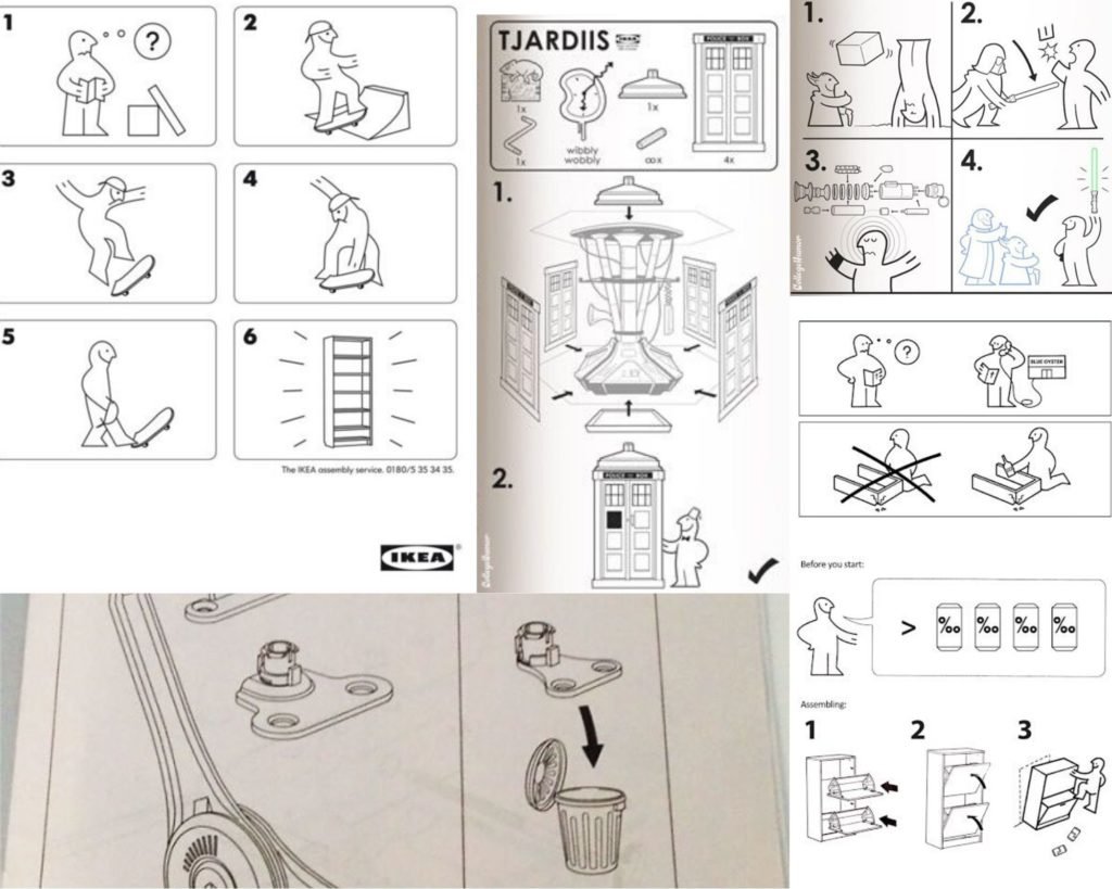
After the interview or interaction with the client, I got to know the insights on how the client wanted the customer to receive the information about the product. The main concern of the client was that the manual should interact with the user in a simplest and unique way which will be easy for them to understand. Most importantly, the manual should educate the user about the compost and its uses and benefits. Also, visually the client wanted the manual to resemble an IKEA product manual.

The insights were gathered and the next step to the process was the market research. I referred to a number of composter manuals online and the data they shared with their users. And as per the client’s demand, I went through the IKEA product manuals and also I referred other product manuals so that I don’t have to visualize through a single perspective. The main features of the IKEA manual were: 1. The illustrations 2. NO content 3. Monochrome

It might get a bit tedious to give information in the easiest way possible for the users to read it properly and efficiently.
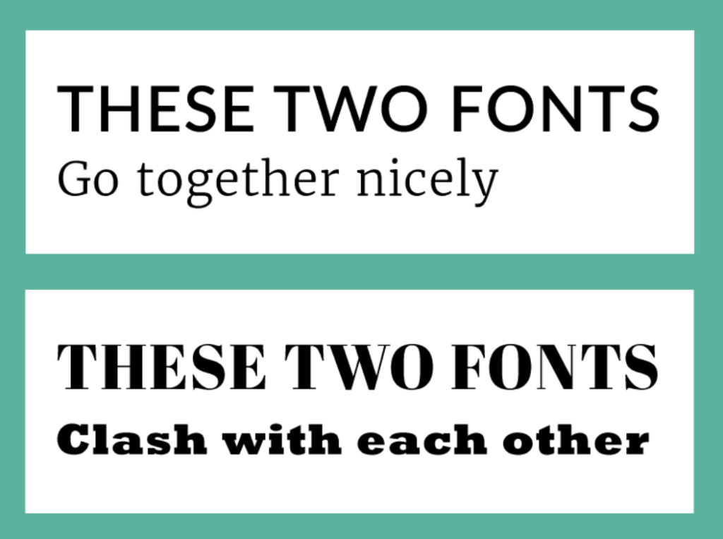
The problem is, when your letters are too close, it decreases readability significantly and makes your design look crowded.
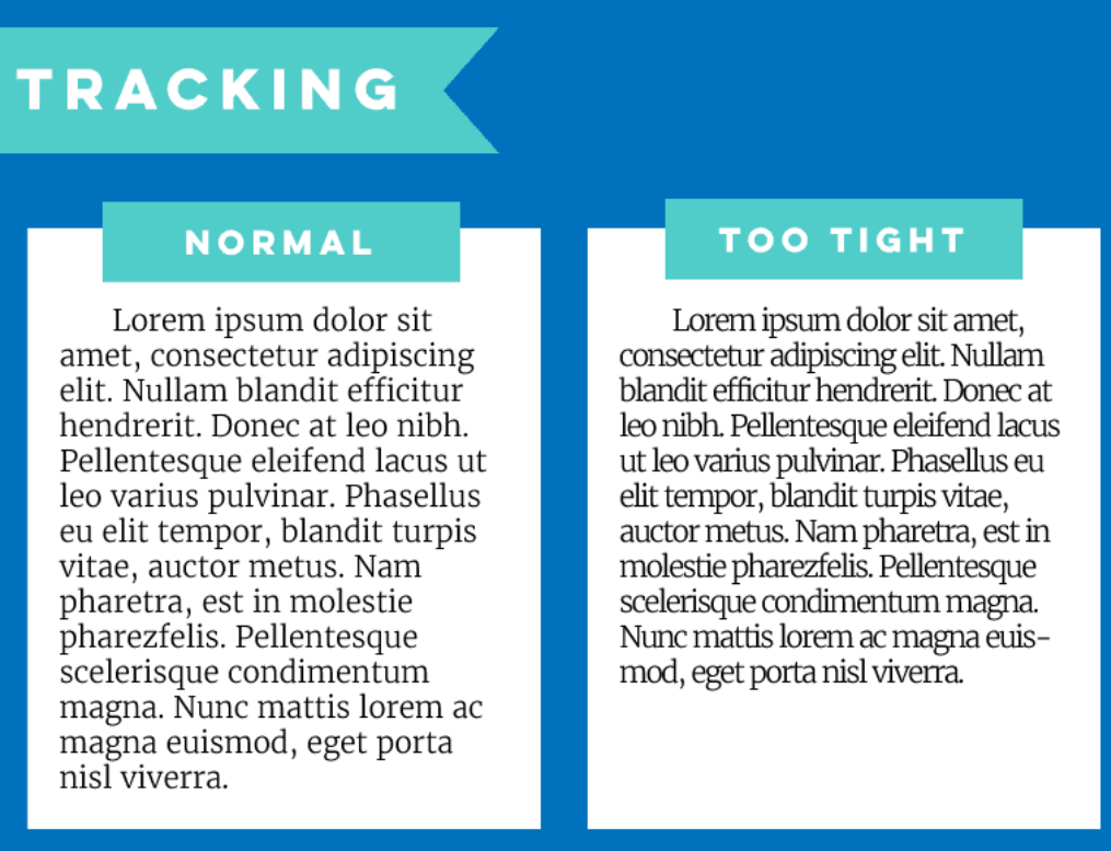
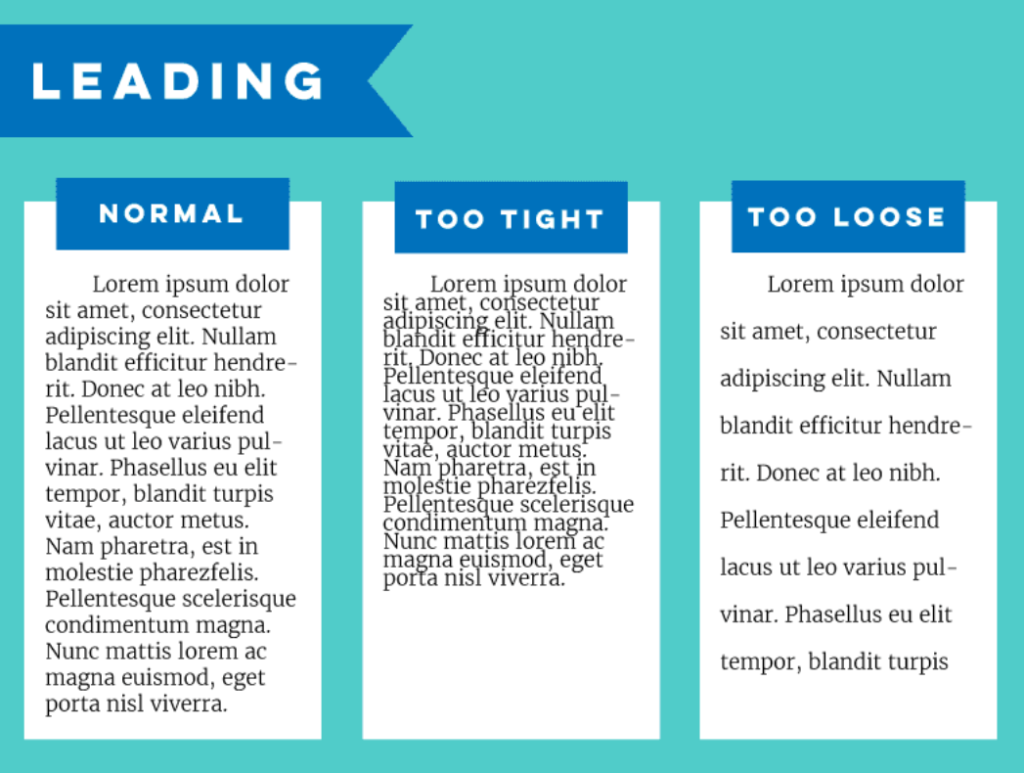
The spacing between lines also affects legibility — you don’t want the spacing to be too tight or too loose.
Another rookie mistake is stretching or condensing words to fit into a certain space.

If you want your design to attract attention, people are going to have to be able to read it clearly.

Sticking to a more conservative approach to typography keeps your design looking clean and organized instead of cluttered and chaotic.

Besides avoiding using too many typefaces, part of making good typography choices is picking fonts that harmonize well. Because when fonts clash, it’s distracting and takes away from your content, potentially preventing your message from getting across.
According to a study, Direct attention is drawn more towards to the illustrations (reading non-verbally), and at the same time we try to find the relationship between the text materials (reading verbally) and the illustrations. During this process, both hemispheres of the brain are involved which consequently leads to deeper retention of new incoming information. Hence, keeping this in mind, I thought of using a blend of illustrations and text and so have the other designers.
So far, I had all the data and now I was able to move further to the next step.
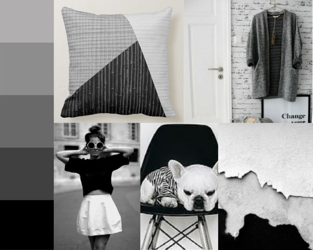
Keywords: Fresh Hexagonal Compact Small Neutral
Colour
There is nothing more simple, minimalist, and sublime than a mono (singular) chromatic (color). One of the aesthetic philosophies I love is: “less is more.” Not only that, but the phrase, “Less, but better” also comes to mind. The fewer distractions you have, the more focus you can have on your subject. Monochrome grayscale: Neutral, Formal, quiet, conservative, communicate maturation.
The color psychology of gray matches the keywords are chosen for the product. Therefore, I finalized the color gray.
Typography
A font is one particular weight and style of a larger typeface. Typefaces are categories comprised of many different fonts. For example, Serif is a typeface, and Times New Roman is a font that is part of the Serif family.
Primary font– Oswald is a free, open-source sans-serif font. It was designed by Vernon Adams and is based on the classic gothic and grotesque styles of the late nineteenth and early twentieth centuries. Oswald is available in light, normal and bold weights. Oswald font is categorized as “masculine,” “assertive,” and “coarse.”

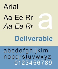
Secondary font– Arial is a design based on the influence of nineteenth-century sans-serifs, but made more regular and even to be more suited to the continuous body text and to form a cohesive family of fonts. Sans serif is categorized as ‘stable’, ‘conformist’, ‘comfort’,’ readable’.
Design
Visual Hierarchy
Visual hierarchy refers to the arrangement or presentation of elements in a way that implies importance. In other words, visual hierarchy influences the order in which the human eye perceives what it sees. This order is created by the visual contrast between forms in a field of perception.
In design, hierarchy is used to:
- Add structure
- Create a visual organization
- Create direction
- Add emphasis
- Help a viewer navigate and digest information easily
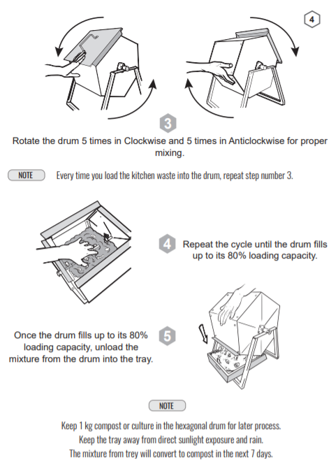
The image below illustrates an ordered timeline or a tree design. The design starts from the above and in this instance, the flow of information starts from the top to bottom. Placed below this is a simple list which is a reference to the visual.
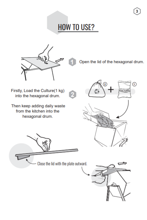
Below, are the product manuals for the Akshay Home Composter, Please do refer: